
H.E.R.S.365 Mobile App UI/UX Design | Figma
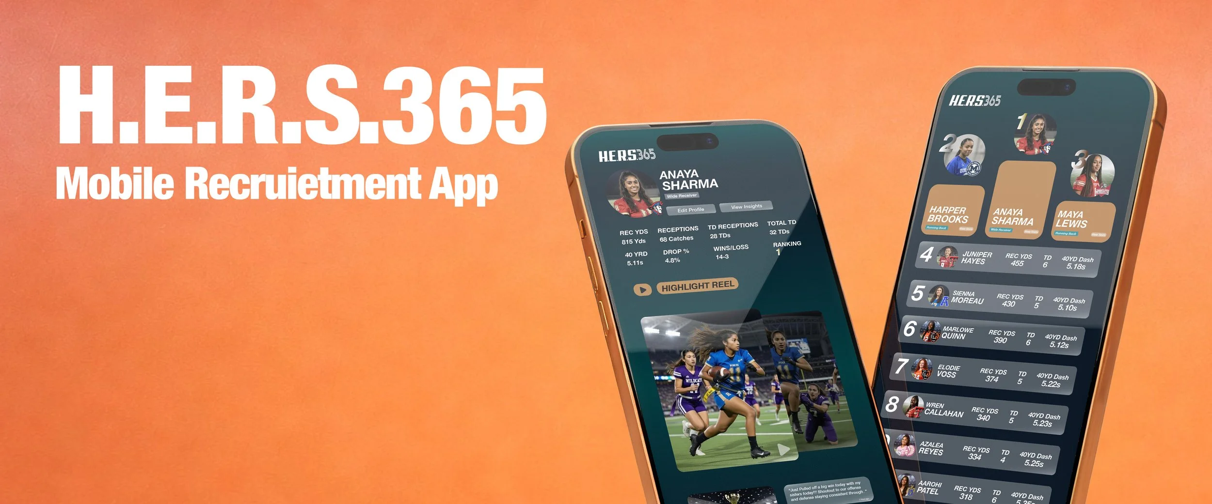
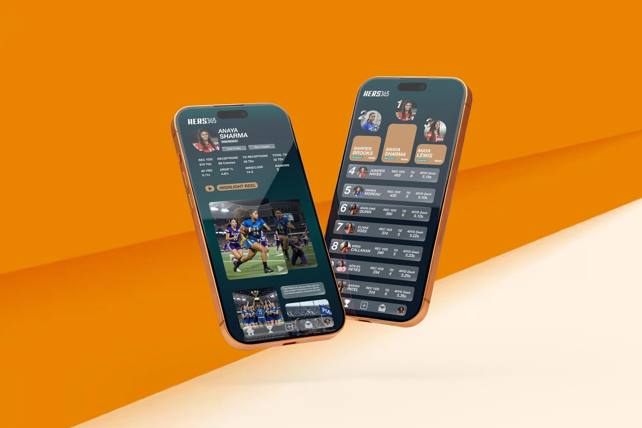
HERS365 is a mobile first recruiting and rankings platform built specifically for girls flag football athletes, ages 13–18. The app gives players a centralized profile where they can upload highlights, track verified performance data, and view their rankings, closing the visibility gap that often leaves girls’ stats scattered across social media and spreadsheets. Coaches, athletic directors, and parents can quickly evaluate talent through standardized metrics and curated highlight reels, replacing manual, fragmented processes with a transparent, data driven view of each athlete. Designed for a social native generation, HERS365 blends trusted data, storytelling, and seamless onboarding to make it easier for girls to be seen, recruited, and celebrated year round.
App idea by Jonte Berry and Estrella G. Lewis, designed by Tory Scott.
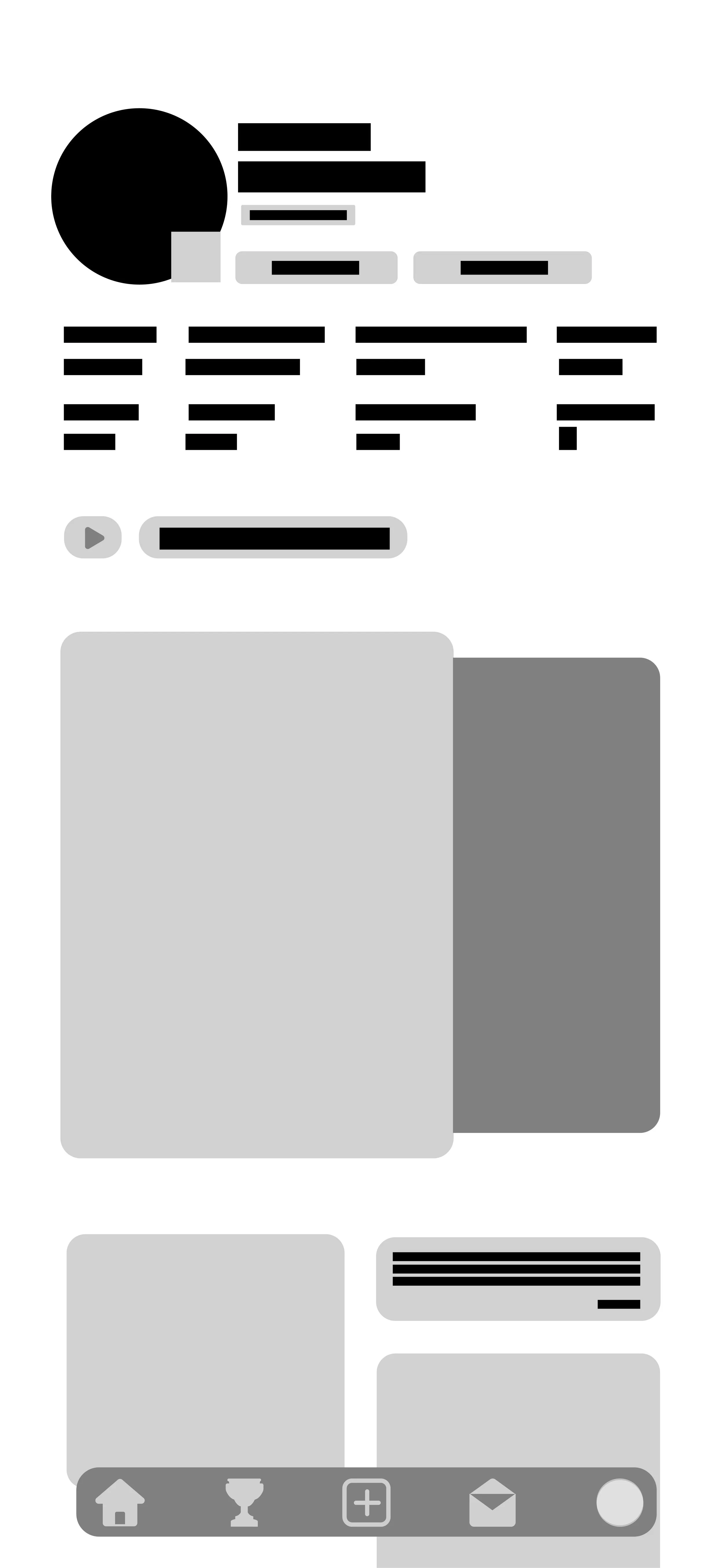
Flow
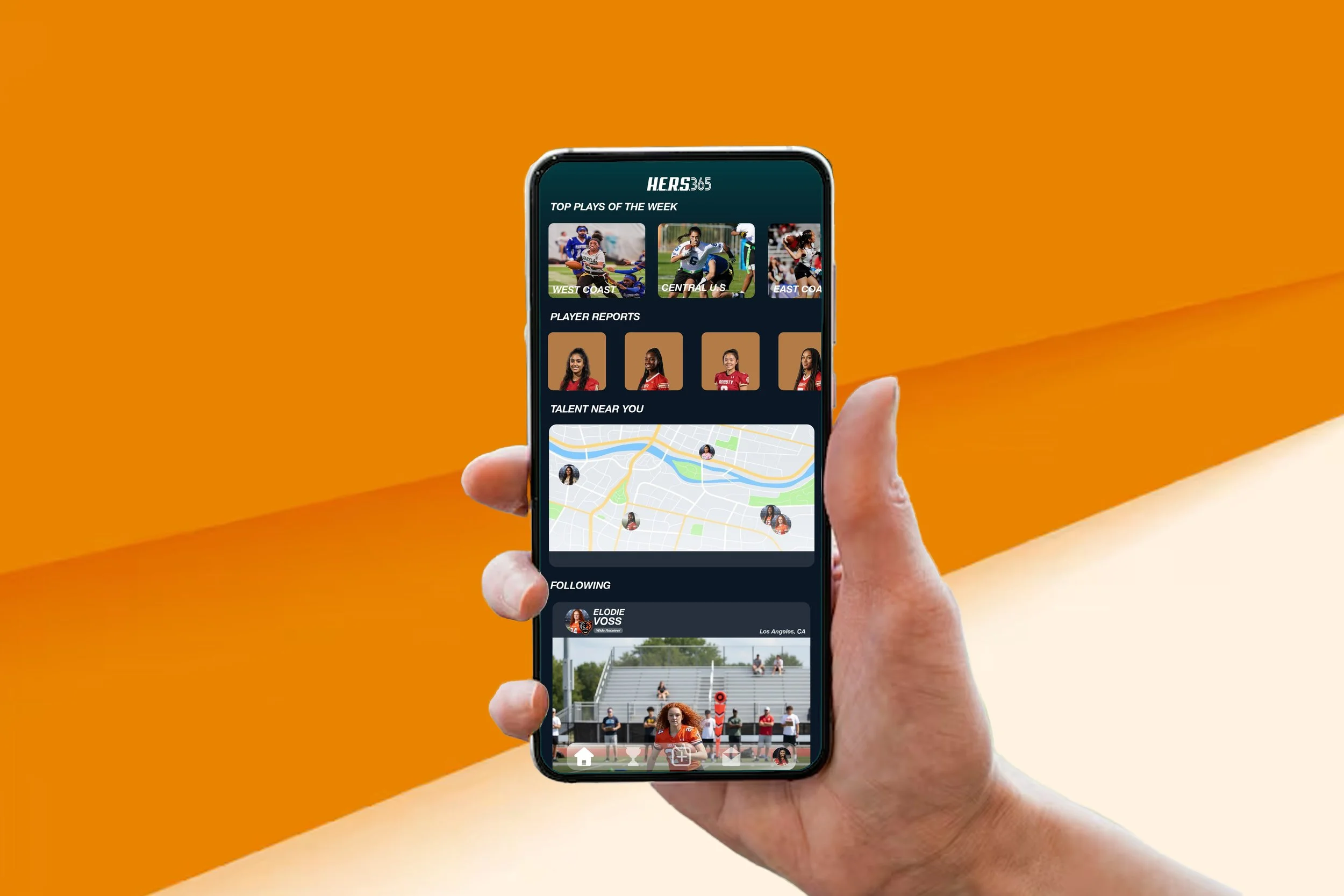
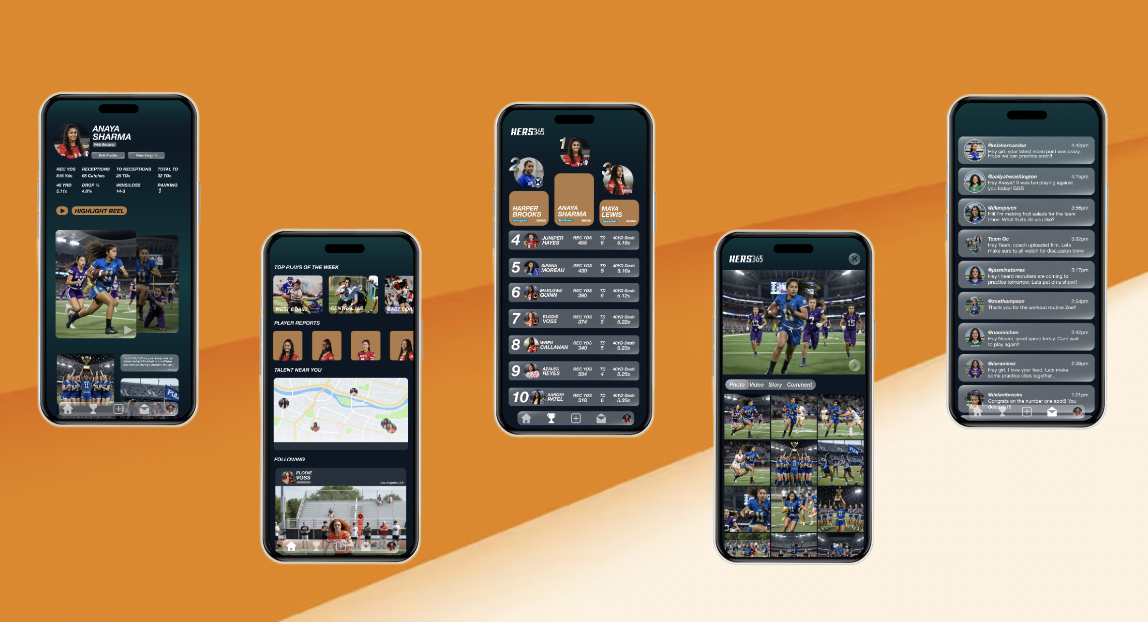
The flow of the app was designed to make this app feel like a tool. It starts off with the home page which is going to be the main center to find new talent, continue to view highlights on athletes that you follow and stay caught up with athletes in your area.
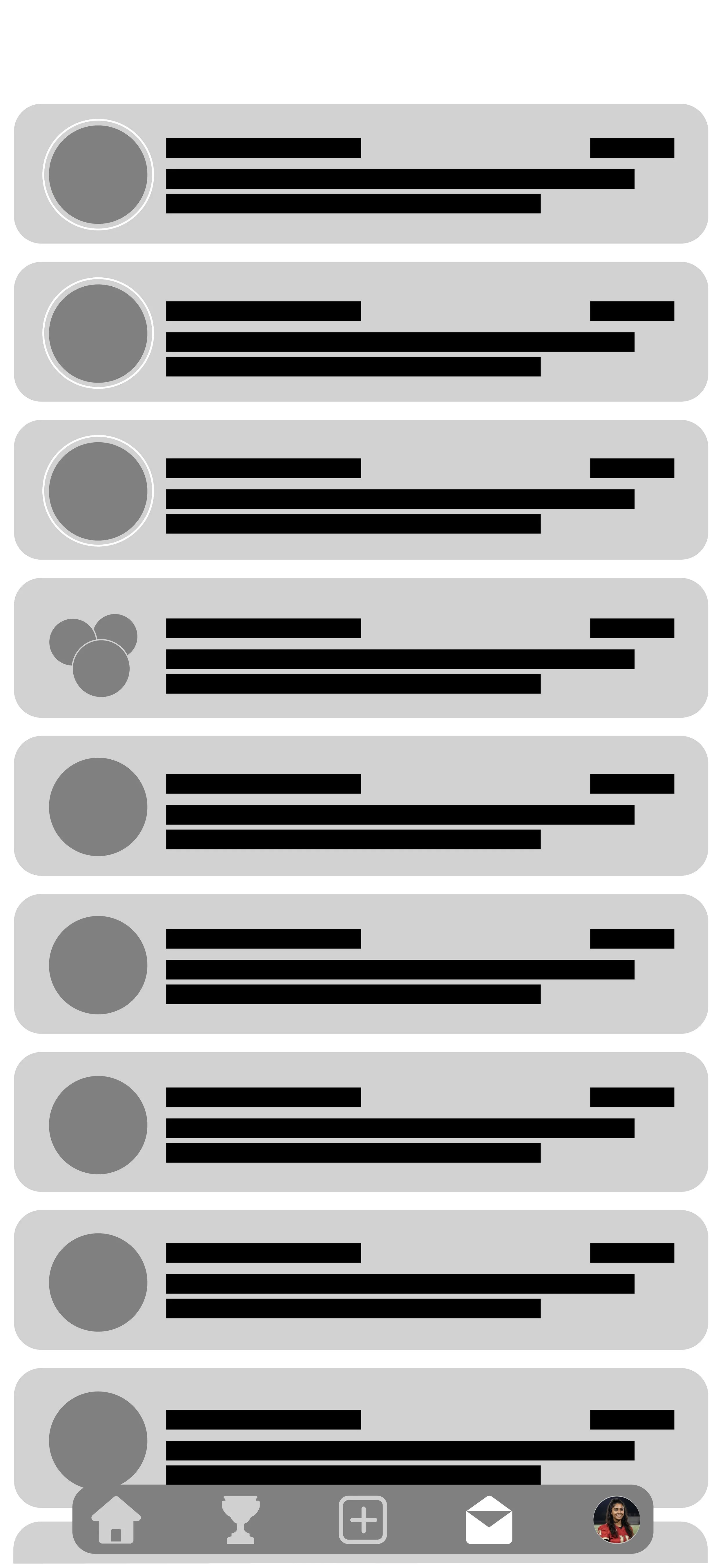
The next page is the nationwide leaderboard where the seasons top athletes are being recognized. You can visit player profiles and use this tool to reach out to the guardians of these highlighted athletes.
For the athletes there’s a quick post option where they can post highlights, photos and send out statements to their followers. Athletes can take advantage of this to show off skills to all recruiters.
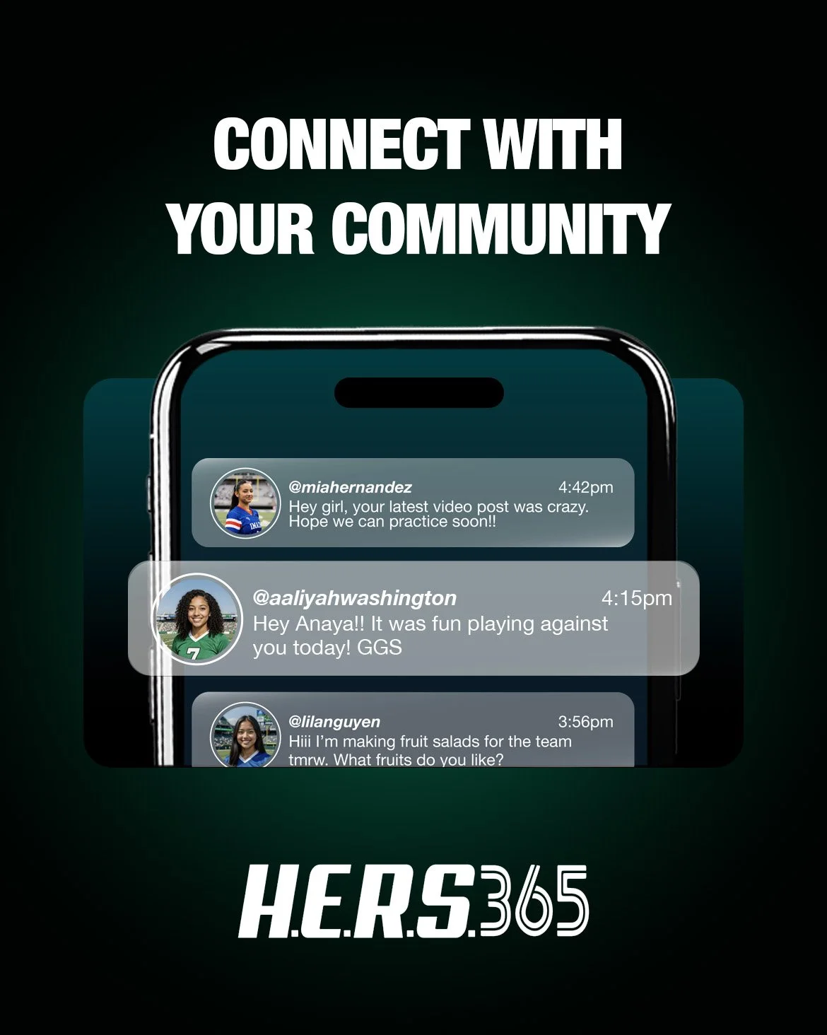
Direct Message is a featured tracked by parents where athletes can talk to only other athletes. This is a great way to connect with your team, meet other players in your community and make friends. Coaches and parents have a separate interface where coaches can only reach out to guardians.
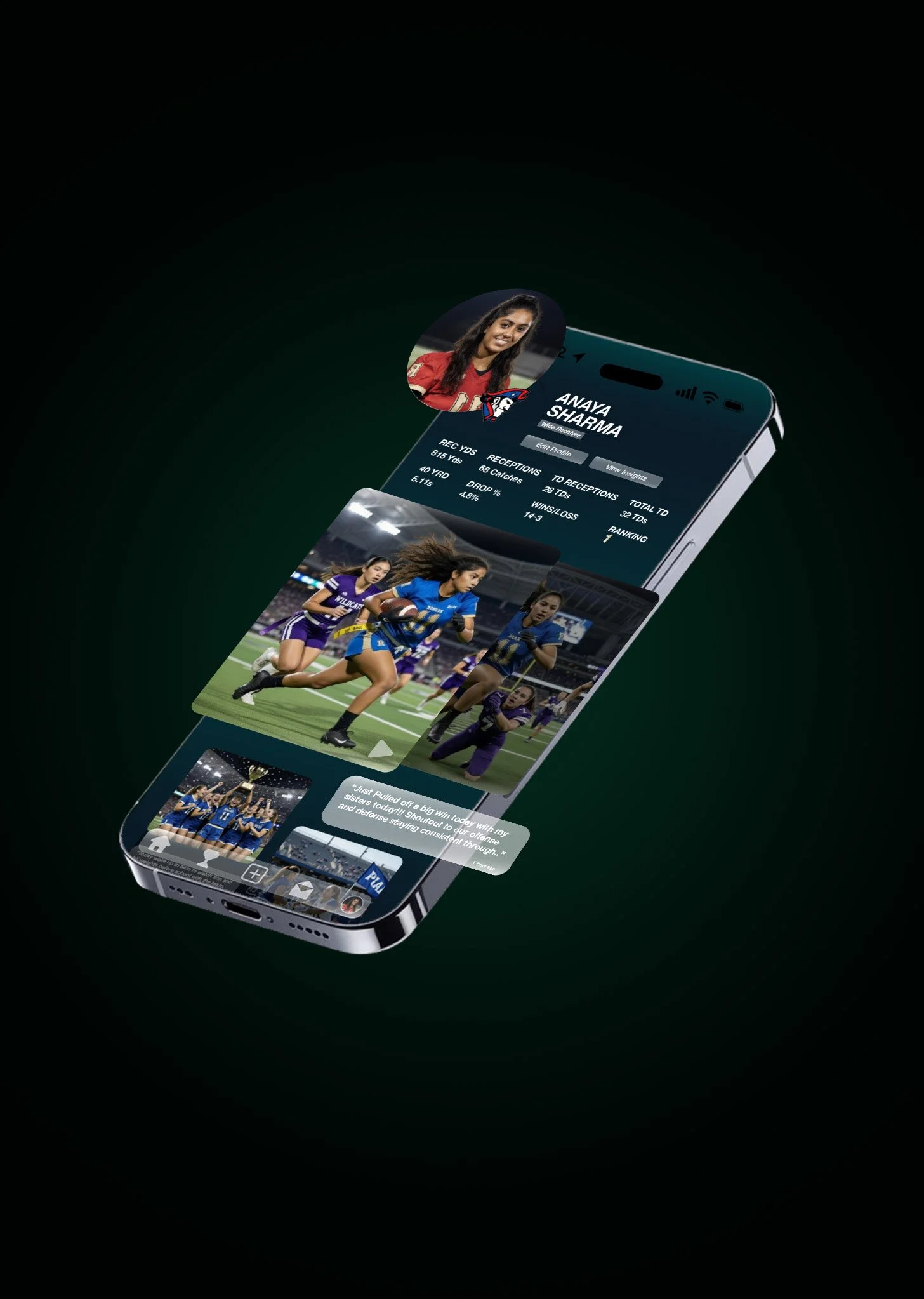
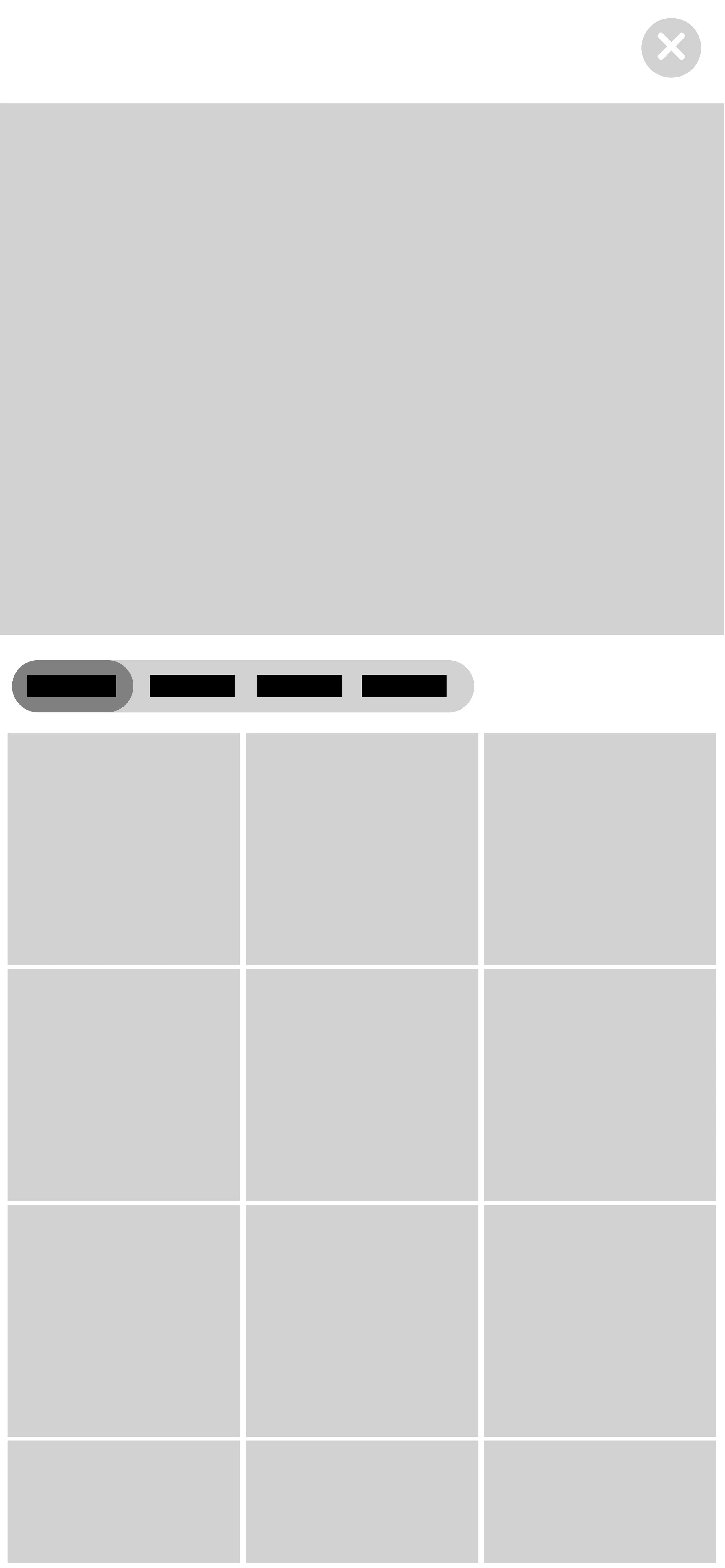
Player Profiles are where you can find all content and stats for a specific player. The profiles contain season by season highlight reels, stats per season and nation ranking.
Design Thinking
Design wise the main navy gradient is taken from stadium lights. I decided to make that a key element because I want the app to feel like a spotlight for these athletes. Oranges are brought in to bring in that nostalgic feeling of summer time football and flag football we remember as a kid. The orange reflects scrimmage jerseys, the top of Gatorade squeeze bottles and cones used for drills.
Layout wise the app is meant to feel like a simple tool. You get on the app and everything is clean and right in front of you. Since so many different demographics are using this app I kept it consistent and clean so all information is easy to understand.
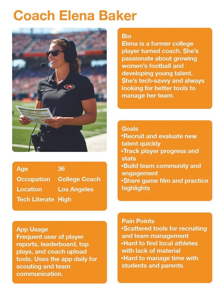
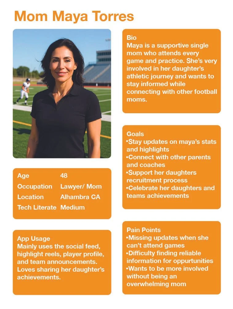
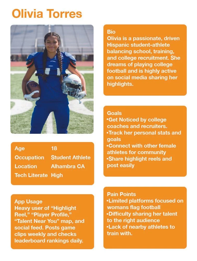
User Persona
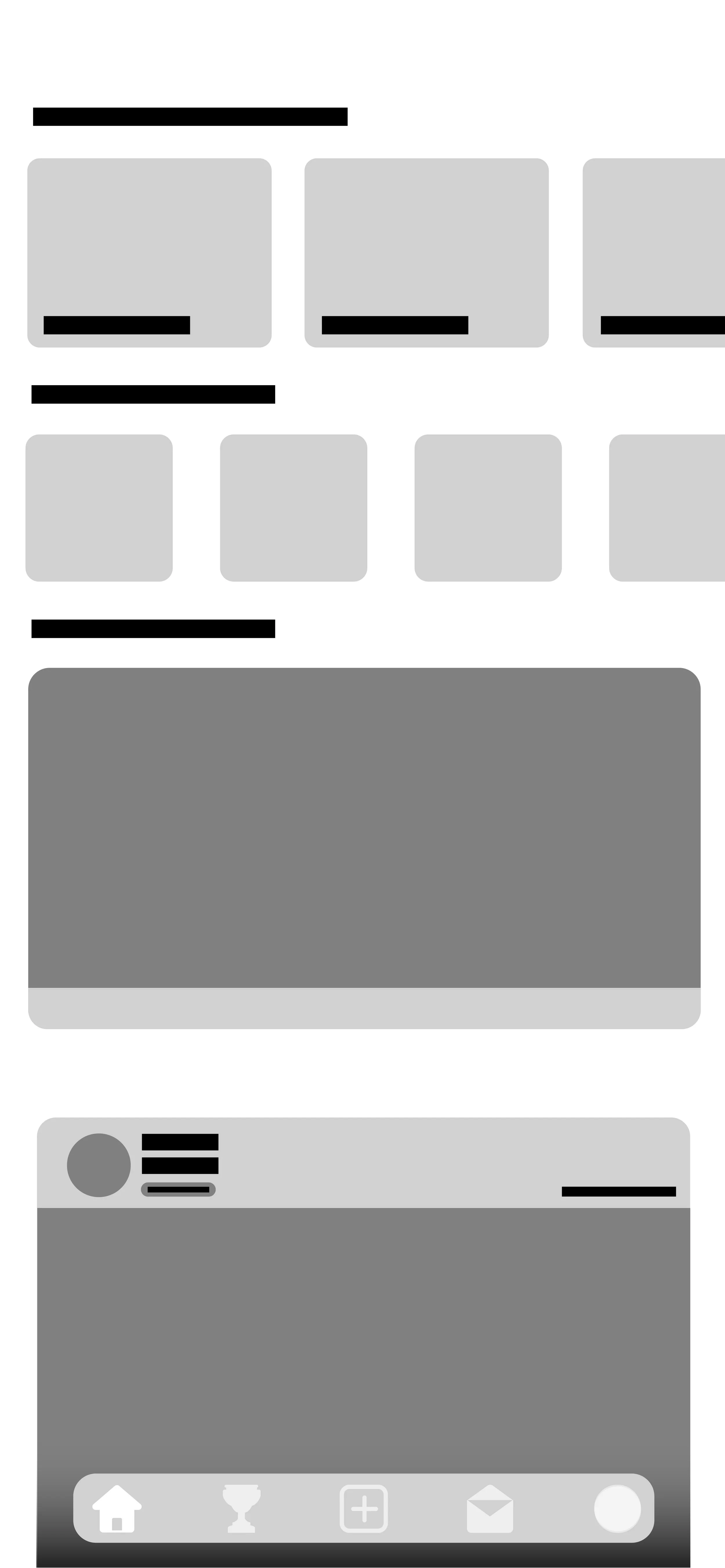
Wireframes
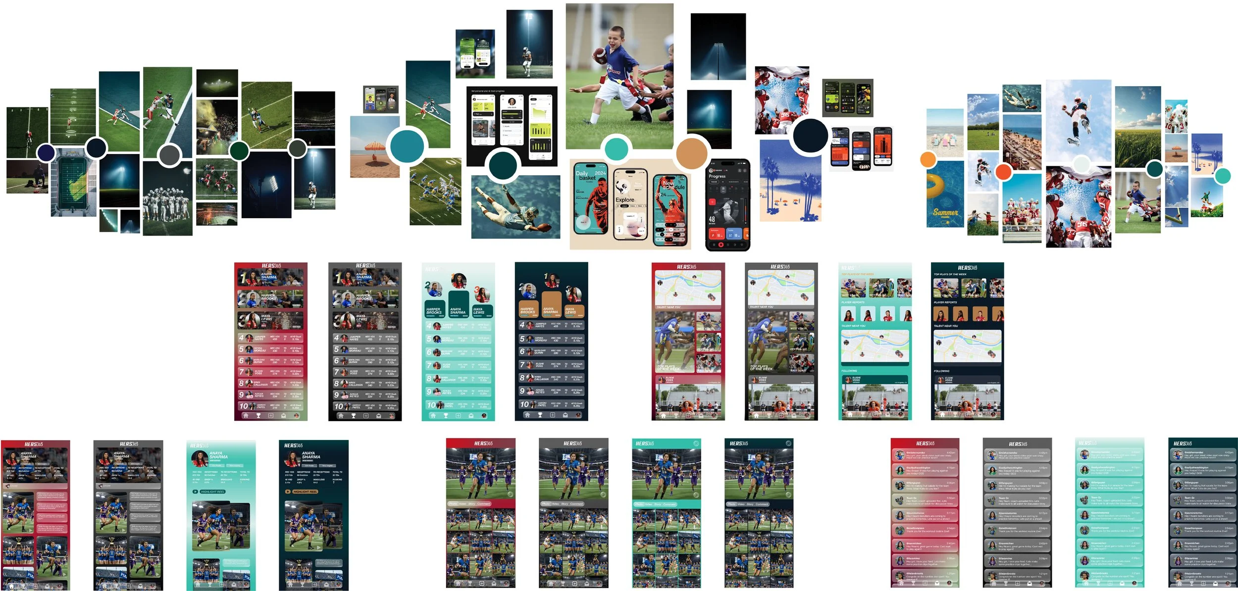
Progress and Moodboards