Sweetgreen Mobile App Concept UI/UX Design – Figma | Adobe Illustrator | Adobe Photoshop
Goal: To create an intuitive, consumer-first mobile Sweetgreen order experience that embodies the resonance of their food: fresh vibrance.
Problem: The existing mobile experience does not feel like an accurate representation of the freshness, variety, and the emotional incentive of eating well.
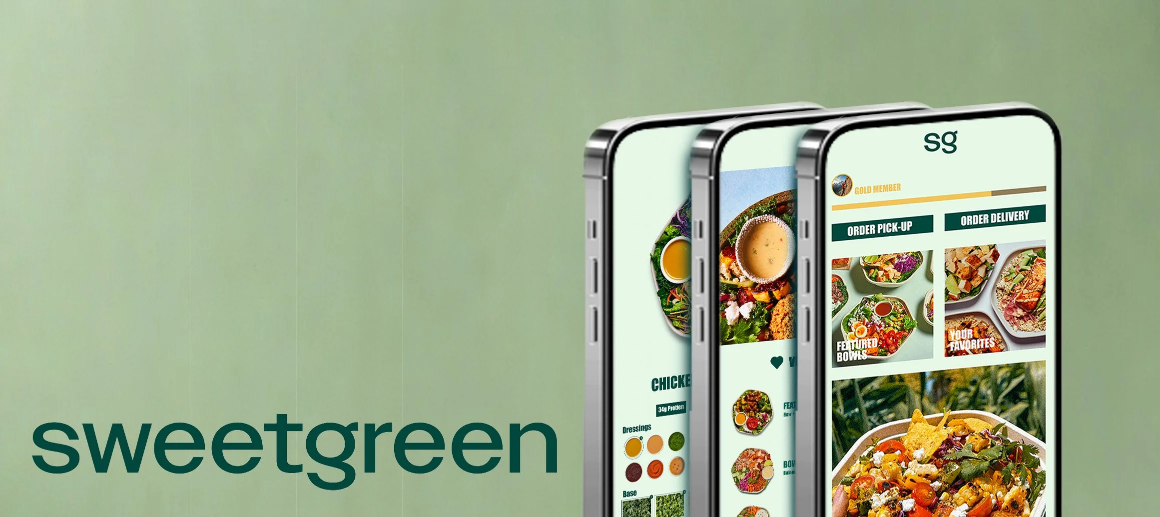
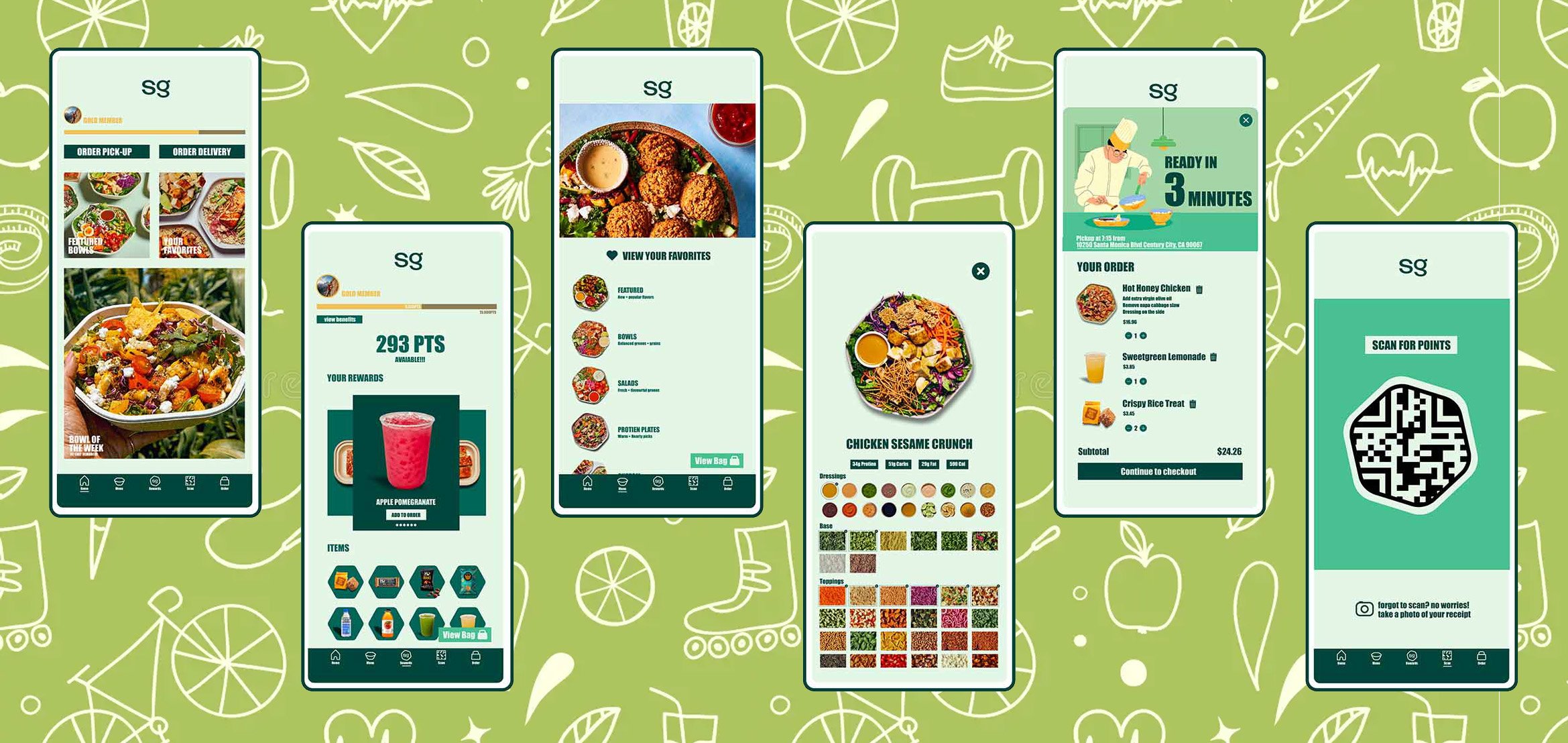
This Sweetgreen mobile app concept explores both the visual design and the instinctive behavioral patterns of the consumer buying process from browsing, to mobile ordering that feels like you’re in the restaurant, and a rewarding loyalty experience. I used a palette of greens and pastels, minimalistic typography, and a clear hierarchy that reflects that brand’s health positioning without undermining the user’s experience.
I focused on simplifying core flows like browse → customize → checkout, adding in micro-interactions, and satisfying features that makes ordering quick on a mobile screen and repeatable. The goal is to show how I can tie brand expression to the concrete UX decisions that I made in order to reduce any friction and encourage frequent usage.
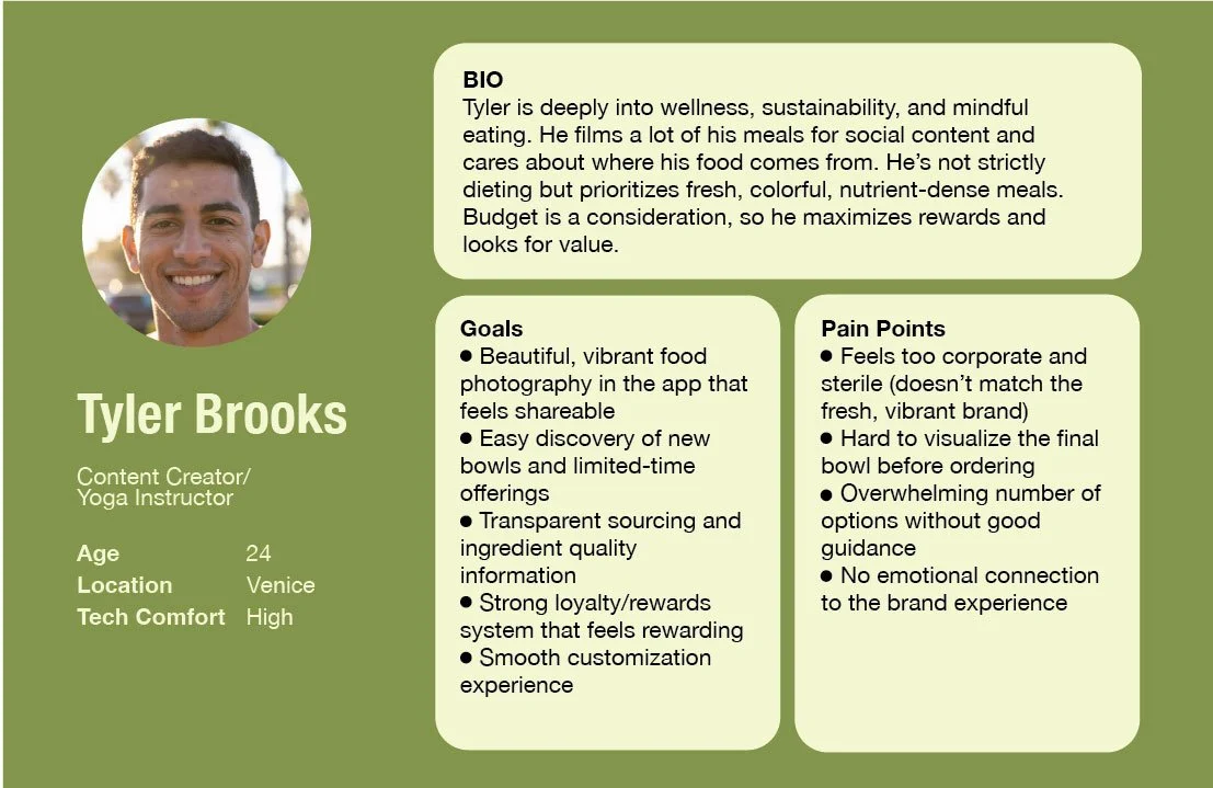
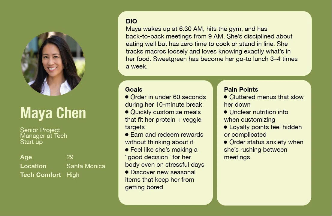
User Persona
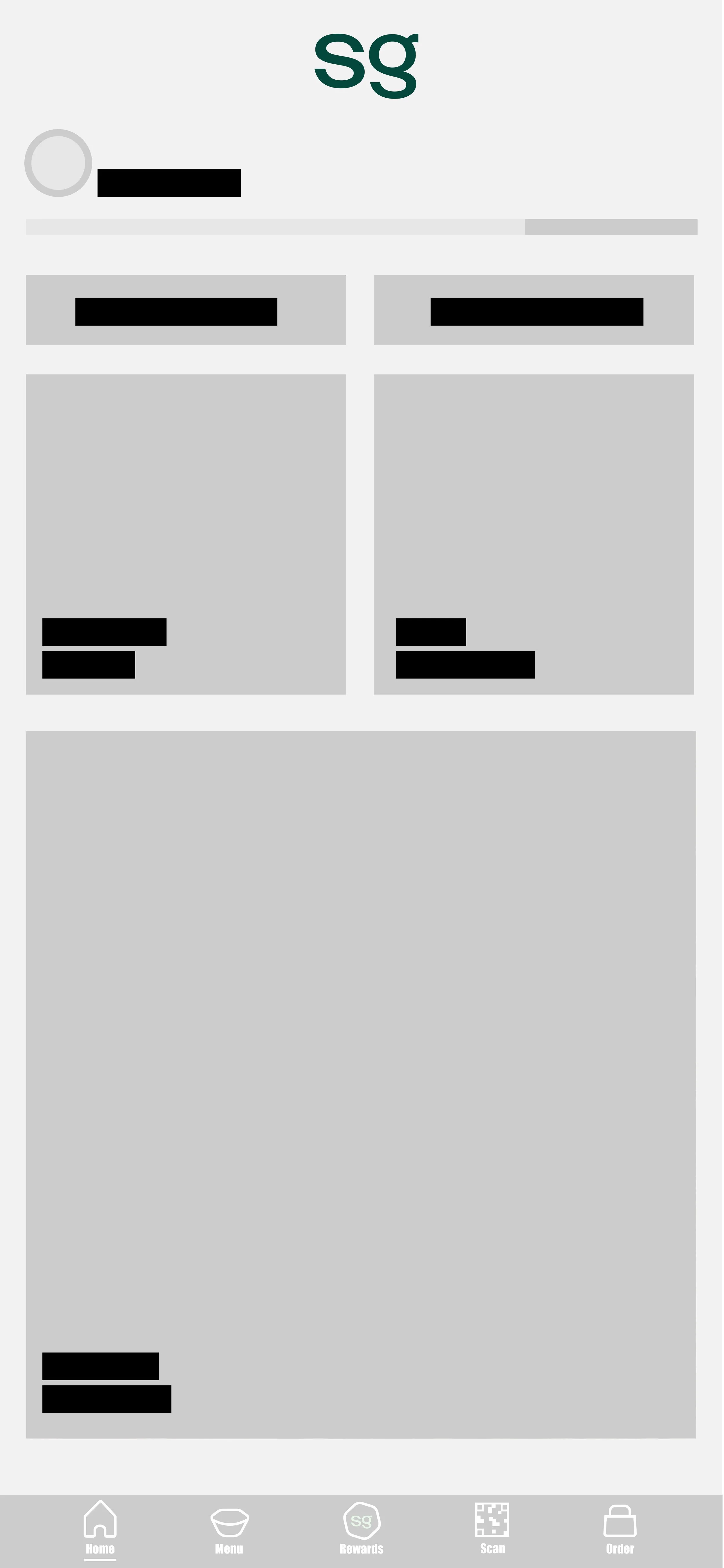
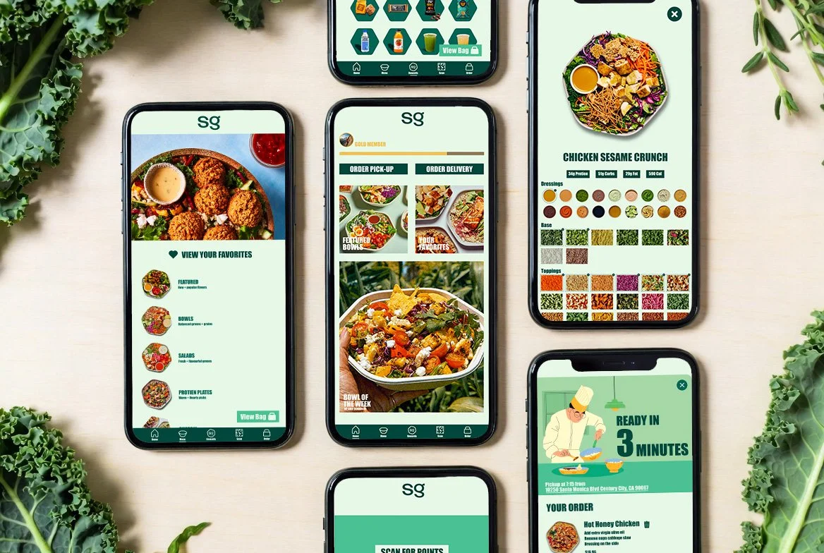
The work flow is meant to have a natural ordering experience mimicking ordering in person.
At the top of the home page you can select your way of ordering. Then your met with your home page where you are met with options to make ordering simple such as bowl of the week, re order, and featured items.
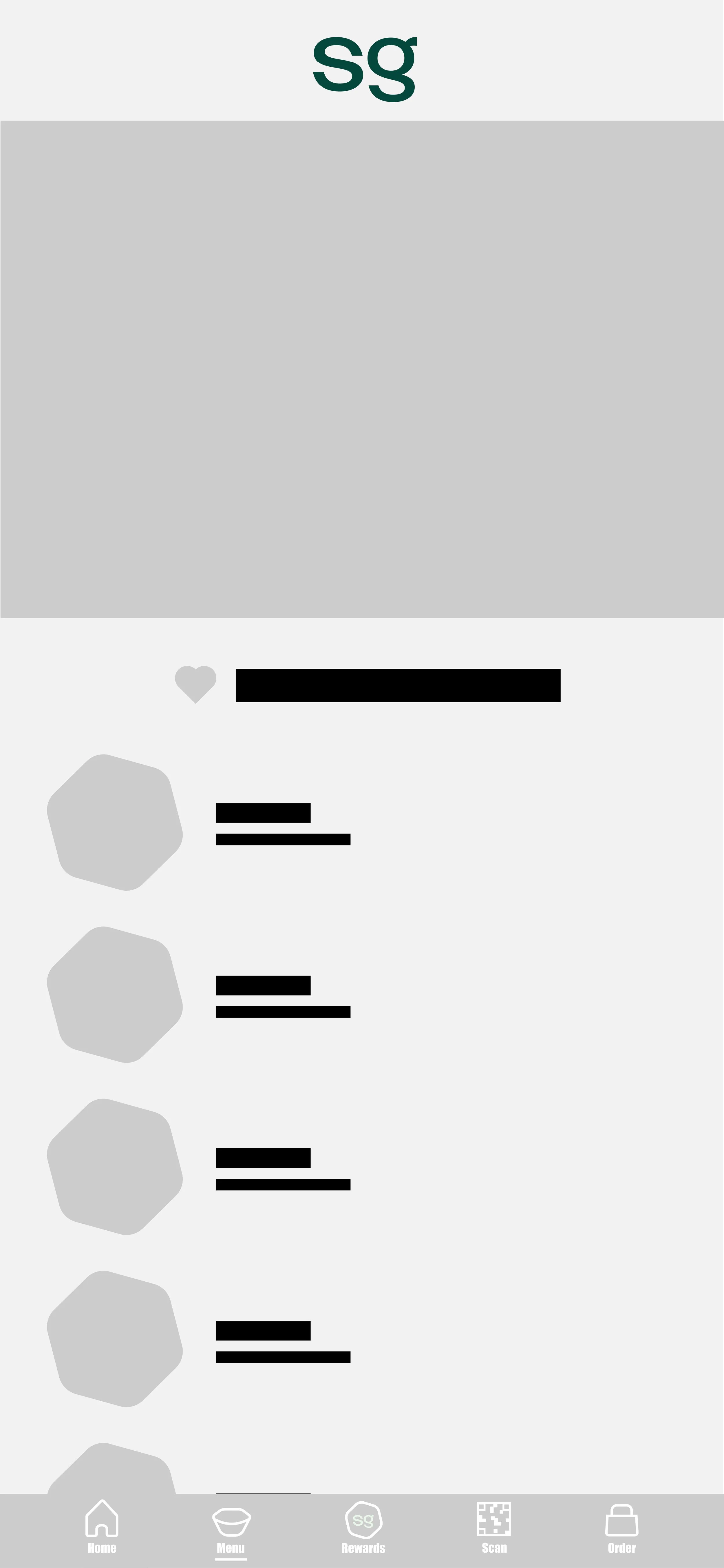
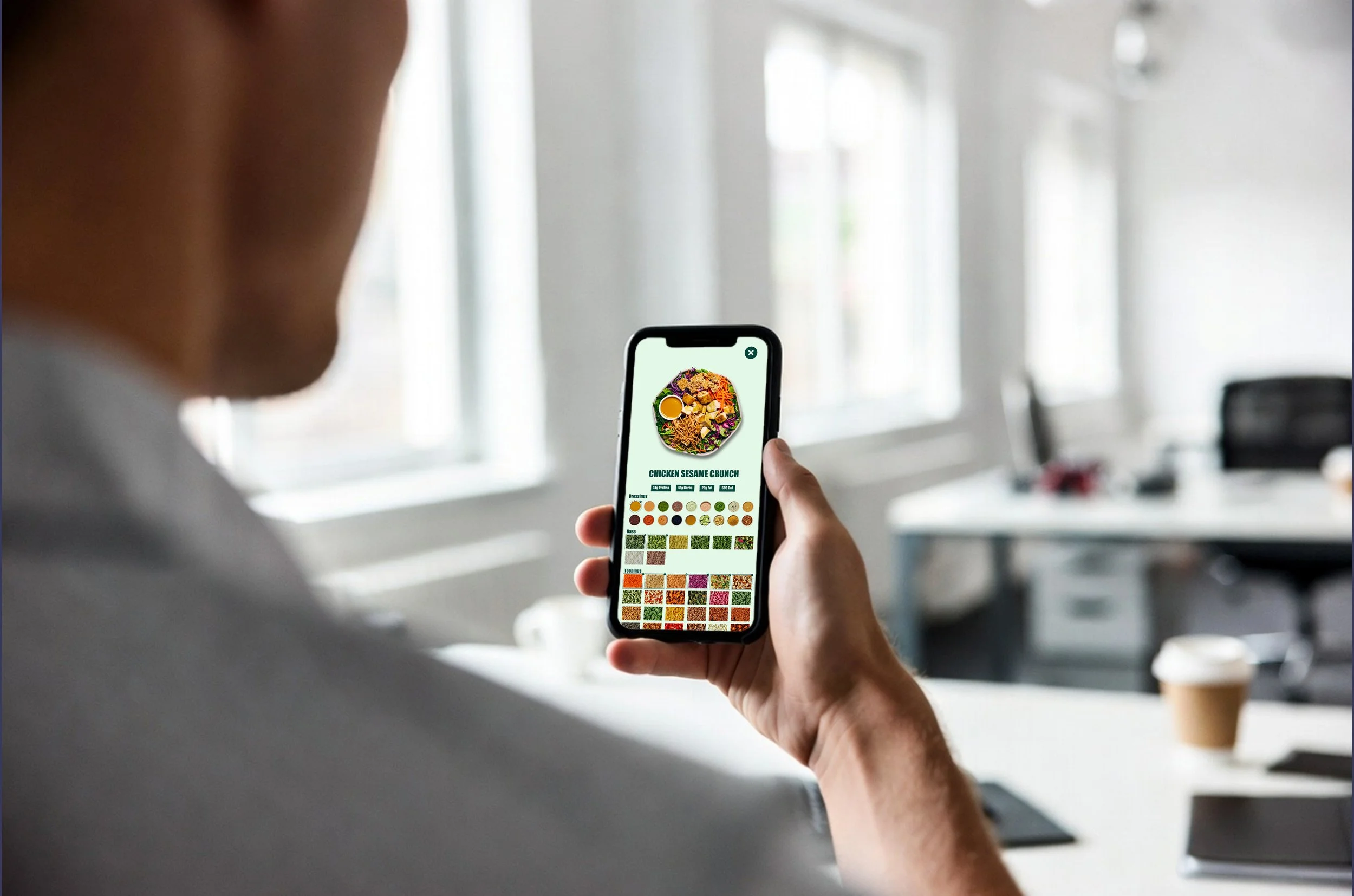
Moving onto the menu where you have a simple and easy to understand line up of entree types, sides and beverages. At the top of your page you also have a favorites menu where you can save your orders as well as re order.
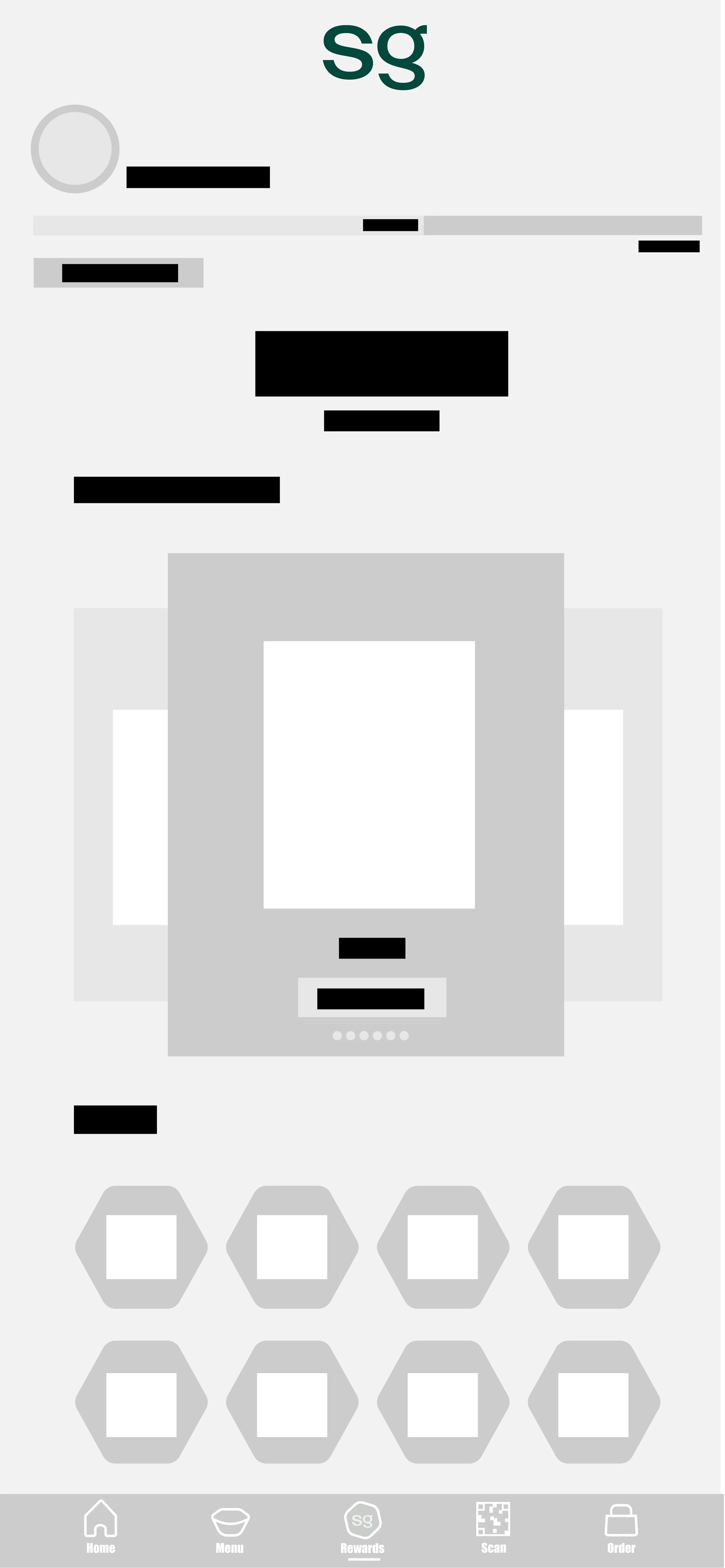
After ordering we have the rewards page where you can see items you have earned as well as your SG reward member status. You can then start building your order with rewards that go straight to your cart.
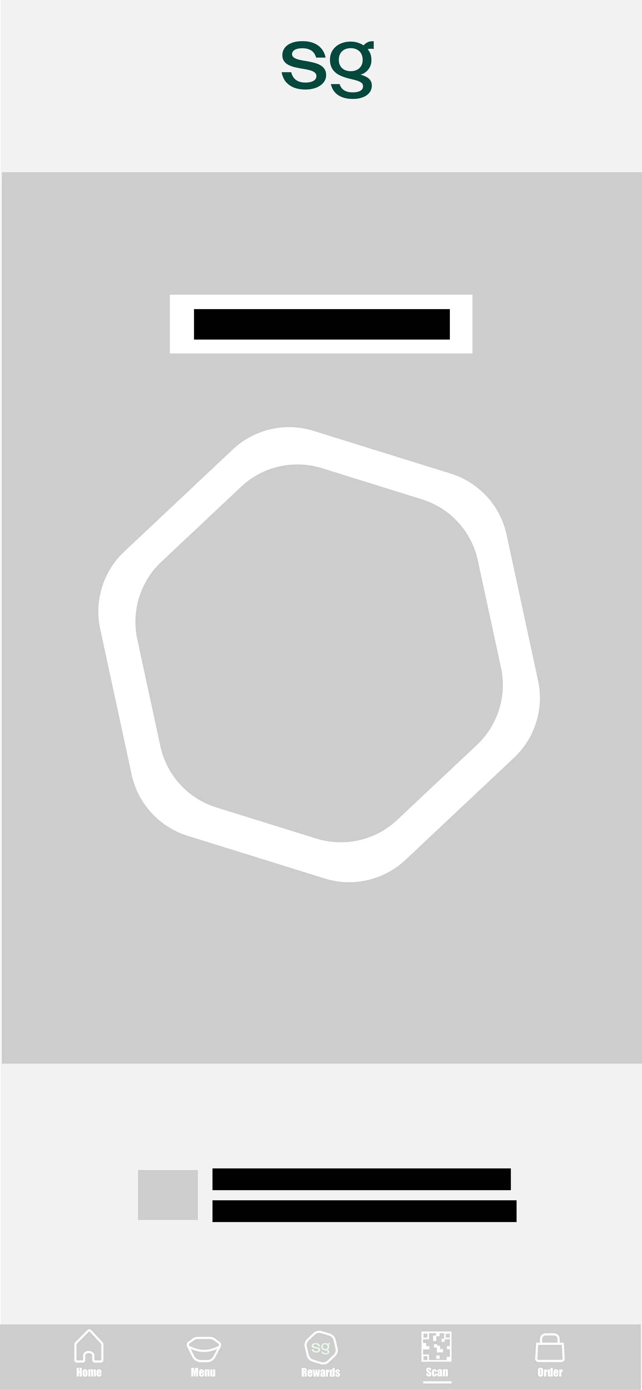
If you’re in store and need to scan there is a scan page where a representative at the franchise can simply scan you in for points. If you forgot to scan there is also an option to photograph your receipt to capture points as well.
Onto the end of the toolbar we have you order tracker/cart. You can track the progress here and check out on this page as well.
Flow
Interface
The interface is designed to reflect and push Sweetgreens brand identity. Using natural and light pastel colors that pull from the logo really compliments the food. The main focus was to make sure the light greens focus on freshness and health while the forest green focus on quality and sustainability.
Through the pages white space stays consistent. With mobile ordering you want the page to feel clean to reflect food quality. The white space also assist pushing the emotions of health and wellness.
Layout wise I kept everything in a simple grid system to make the navigation feel as simple for the user as possible.
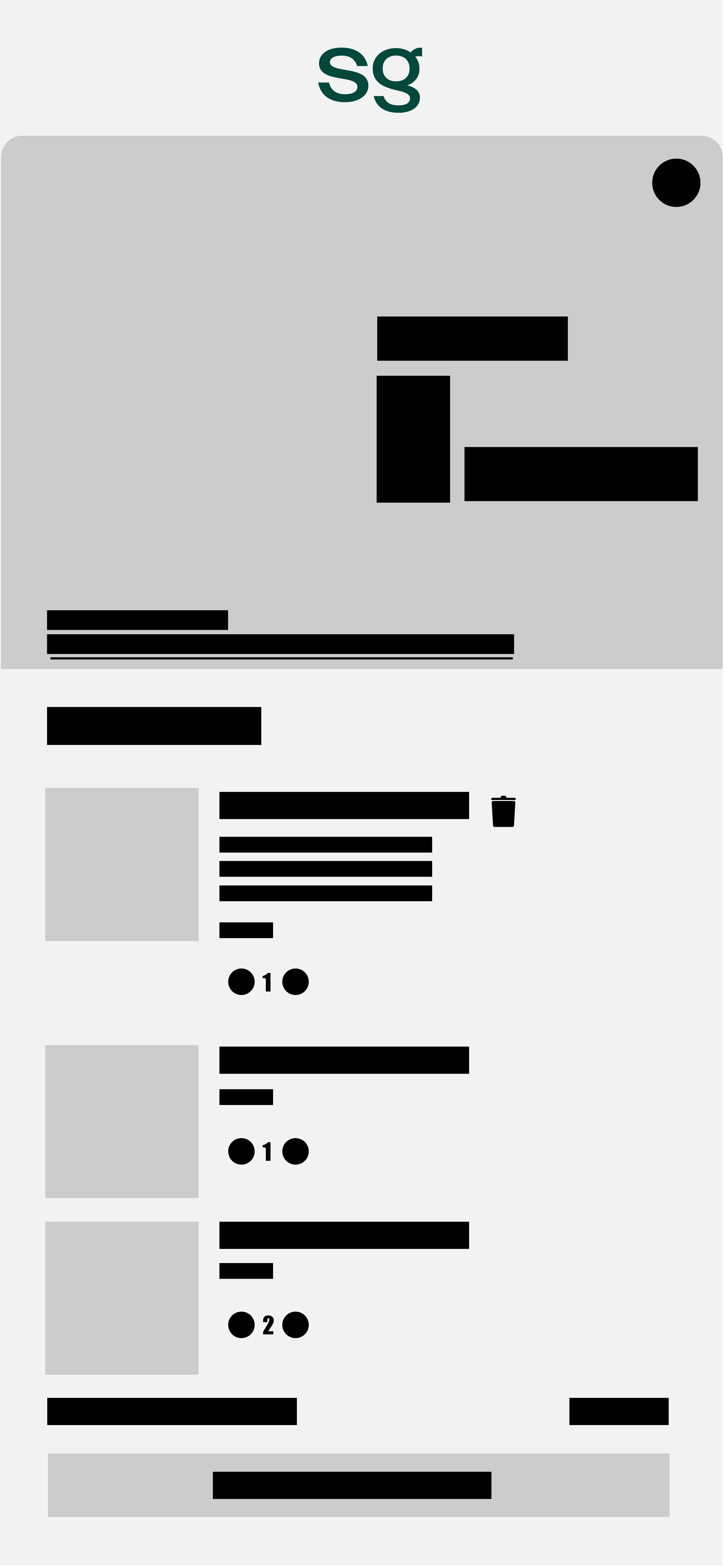
Wireframes
The whole design thinking process was to make going through this interface feel like you’re step by step ordering. It’s meant to take the user on the simplest journey possible while still keeping them in an interactive space.